HoneyBook is an app that helps photographers, wedding planners and other creative professionals book and manage their clients. As a tool for small businesses, we wanted to give them a "control center" where they could quickly manage priorities and get a snapshot of their business metrics.
During the project, I worked closely with a team of 5 developers and a Product Manager. My role included:
Design & UX | User research
The dashboard helps creative professionals prioritize their tasks.
Digging into the problem
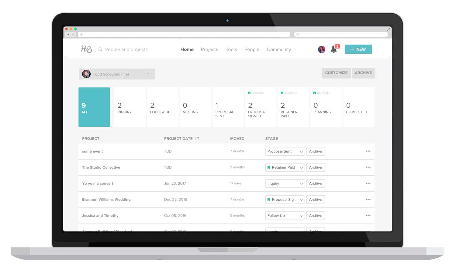
Original home screen: The Pipeline is not a good experience for new users.
The challenge:
- Improve new user experience: When a user logs into HoneyBook, they're greeted by the Pipeline — A place where users can track their client's progress along stages. The Pipeline has a high learning curve and is not friendly for new users (50% of trial users never return to HoneyBook).
- Better visibility of priorities: One of the most common complaints with the pipeline is a lack of prioritization. There is no way to identify new items, or know when a client is waiting for a response.
Exploring solutions
Initial explorations: I first wanted to get a good understanding of the problem. I started by researching existing dashbaord apps, digging through customer feedback and thinking about the core features we'd need.
I created several high level wireframes and showed them to people around the office to get some initial feedback. Then I went back to the team to brainstorm some more and discuss the next steps.
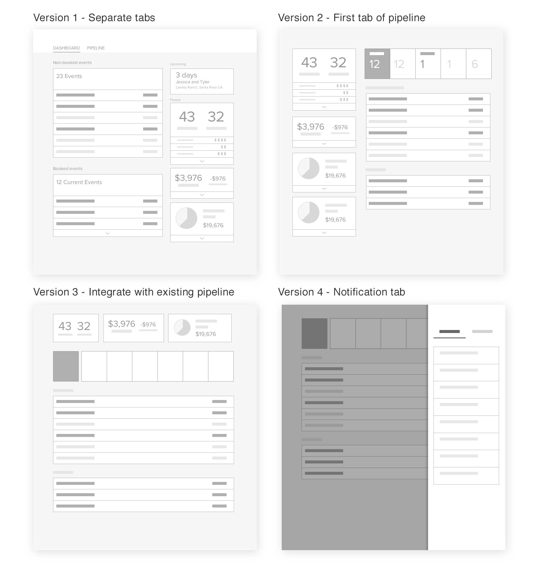
Getting user feedback: We selected three concepts to move forward with. I created slightly higher fidelity wireframes and with the help of our UX researcher, set up 5 calls to share our ideas and gather feedback from real users. We learned:
- The most important thing people wanted was a (daily) prioritization of their tasks.
- People didn't care about high-level metrics like booking rate, they wanted more actionable metrics like which packages were selling most.
- When figuring out their priorities, people wanted to see their calendar schedule.
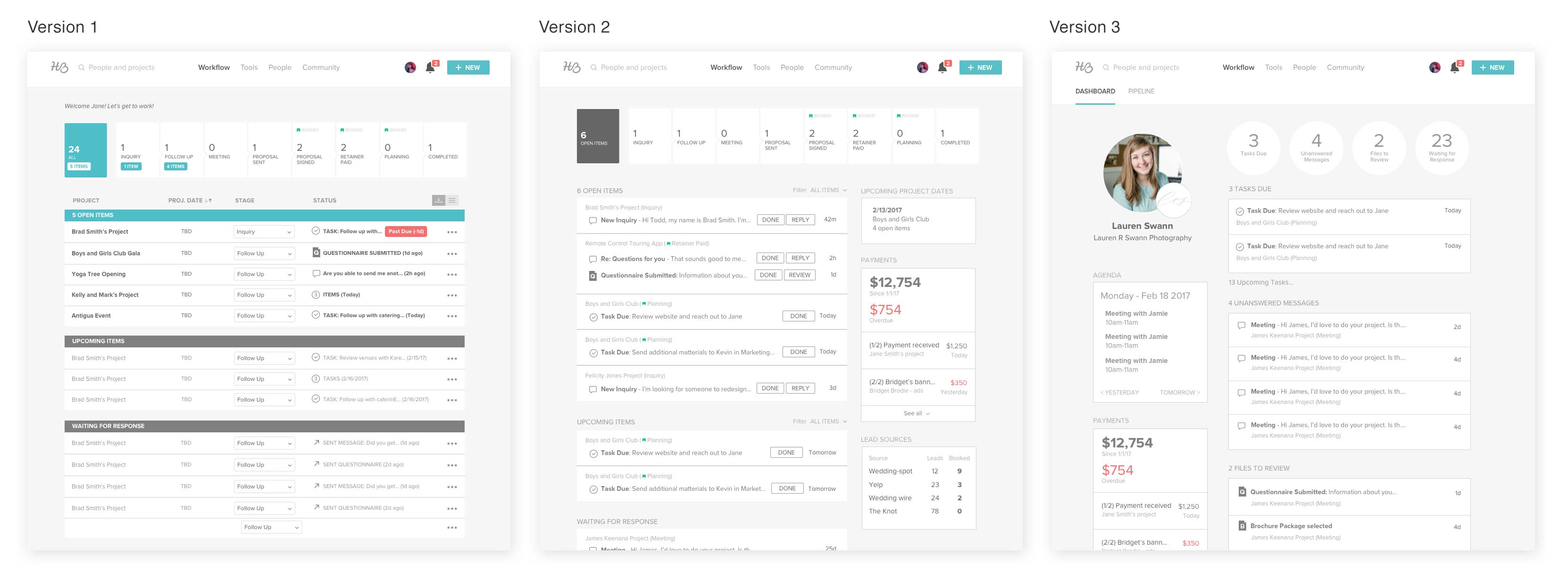
Most people preferred the dashboard separated from the pipeline - Version 3
Making sure nothing slips through the cracks
One of the issues with the Pipeline was a lack of prioritization. When I dug further into the problem, the core concern was that people didn't know when the ball was in their court or their client's court. They wanted the assurance that their client wasn't waiting on them for anything. Likewise they wanted to know if they were waiting on the client for anything.
I designed dashboard with two main sections:
- Items I need to take care of - This gives people the assurance that they've taken care of all the current loose ends.
- Items I'm waiting for others to take care of - This lets people know if they're blocked and if they need to follow up with clients.
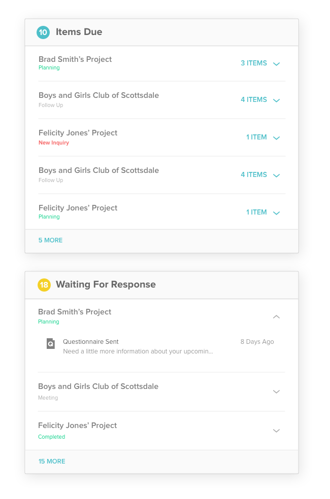
Projects vs. Items
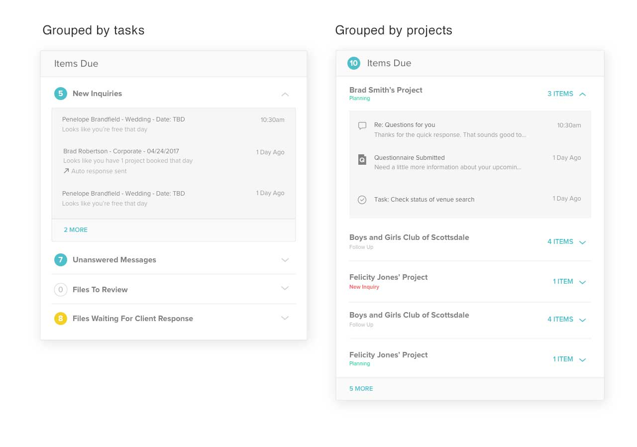
Another challenge was organizing the Items due section. From our user research we learned people preferred to see tasks grouped by type. For example, seeing all the new messages grouped together vs. files to review.
But after I brainstormed this solution with the PM and other designers in the company, we realized that grouping by project was a better solution. Grouping by type provides no visibility of the other items in a project. For example, if a client submitted a file and also sent a message, grouping by project gives the user a much better context of what they need to do next.
Working through the flows
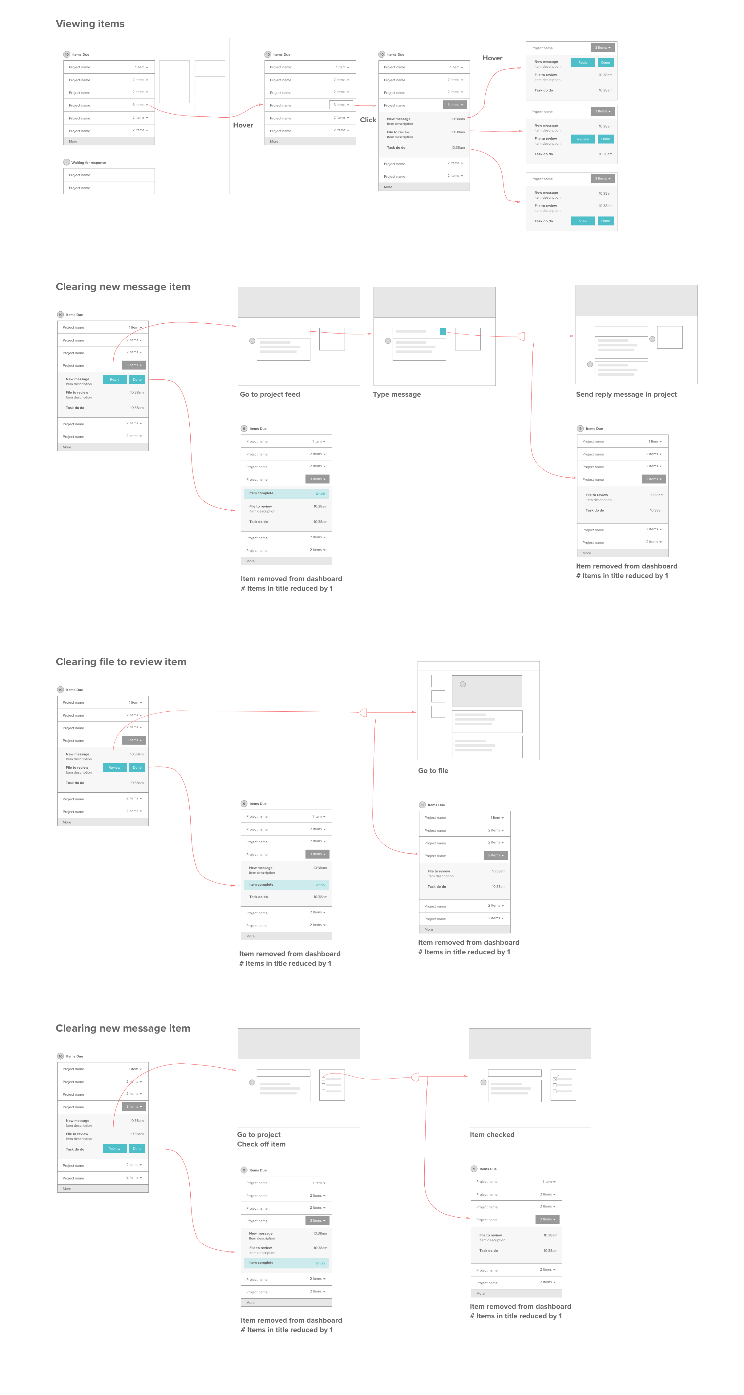
After we decided to group items by projects, I created flows to document the interactions and logic for each step.
A friendly banner
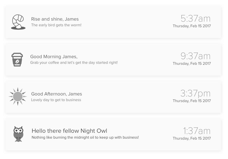
The idea of a dashboard to manage your business can be overwhelming and dry. I wanted people to feel calm, and make the experience friendly.
I was working late one night and came up with the idea of creating a conversation with the user based on the time of day. The idea was that we could show people we understood their situation - that a lot of small business owners work late, or that the creative industry has a strong affiliation with coffee!
An improved experience
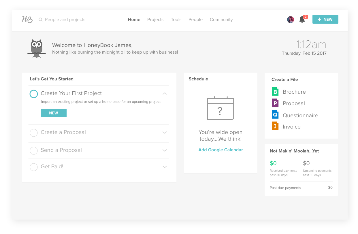
New users are guided through easy introductory steps. I also designed the new user experience with a focus on progressive disclosure — hiding the items due and Waiting for response sections until the user receivs their first reponse.

For Expert users the main focus is on the current items due, while the other sections are slightly muted. A snapshot of their schedule for the next two days gives them a complete picture of their priorities.
A seamless mobile experience
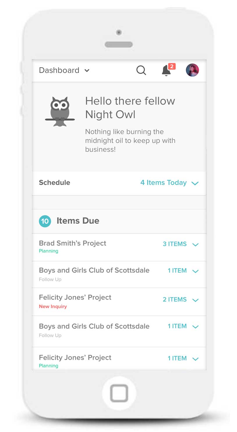
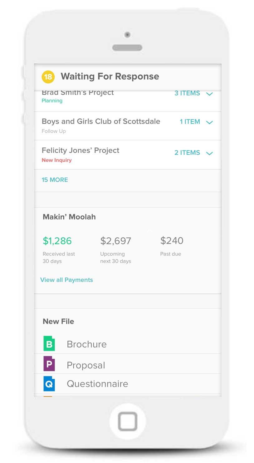
A lot of times, creative professionals need to manage clients remotely. Although we have a native mobile app, the experience was limited and it was important to create a seamless dashboard experience for the mobile web.